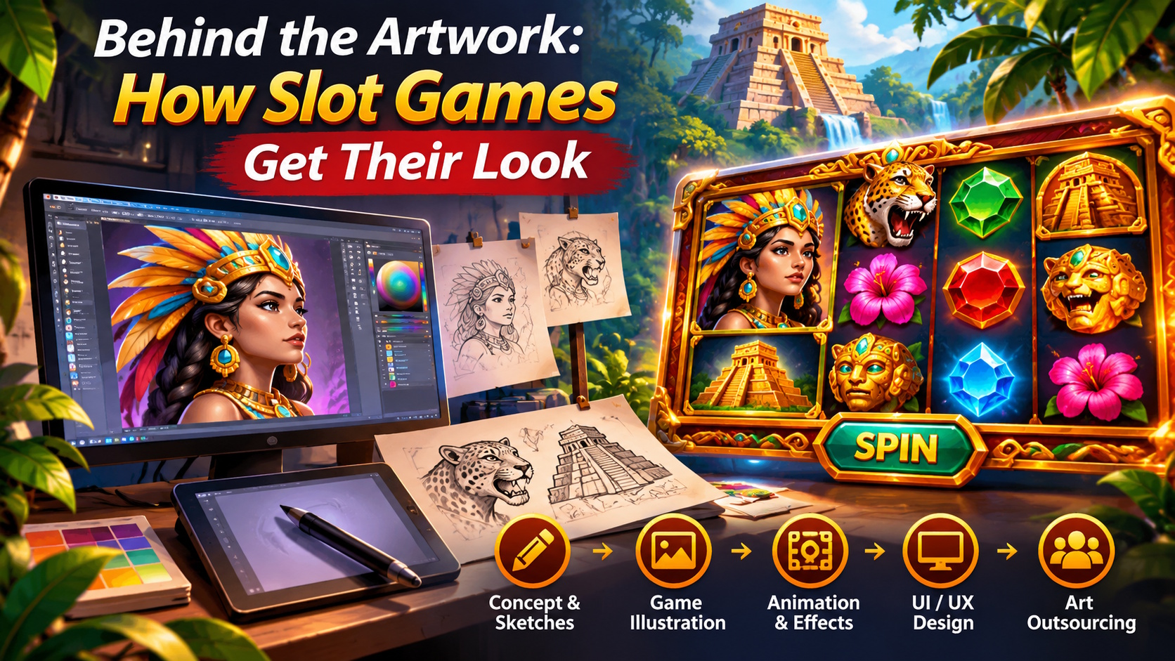
Next time you load a slot game, ignore the reels for a second and look at everything around them. Maybe there’s a crumbling temple in the background. Maybe the symbols are hand-painted gemstones, or a cartoon fox that winks when you land a win. None of that happened by chance. Someone sketched it, someone argued about it, and someone probably redrew it three times.
Even a small slot game needs a lot of art. Symbols, backgrounds, characters, buttons, bonus screens, animations: all of it has to look like it came from the same world. If you’re a studio weighing your production options, it’s worth seeing how specialists handle paintpoolstudio.com/game-art-services/slot-games-art-service/ and what goes into building these assets.
Every Game Needs a Personality
Picture two developers. One is building a game around ancient civilizations. The other wants deep space. The reel mechanics might be nearly identical, but the art has to tell two very different stories.
The first game might lean on weathered stone, bronze trim, and desert light. The second might use brushed metal, glowing cores, and strange planets. Same math underneath, completely different feel on top.
That’s what concept art is for. Artists don’t jump straight to polished graphics. They try a few directions first, and most of those directions get thrown out.
Rough Sketches Do the Heavy Lifting
Early sketches aren’t meant to be pretty. They’re meant to help the team decide.
An artist might draw a main character three ways: different outfits, different proportions, different expressions. The team picks one, and only then does the detailed work start.
Sketches also expose problems early. A design can look great on a full-size concept sheet and turn into an unreadable blob once it’s shrunk down to symbol size. Better to find that out on day three than week six.
The Smallest Graphics Take the Most Care
Players see the same symbols over and over, hundreds of times in a session. Each one has to be instantly recognizable without being cluttered.
Take a gemstone. It needs clean edges, believable reflections, and enough contrast to pop against the reel. Pile on extra detail and it actually gets harder to read.
Premium symbols and characters are a different story. They usually get more texture, more expression, and more careful lighting, because they’re supposed to feel special.
Building the Symbol Set
Most games use some mix of these:
- Standard symbols: The everyday reel fillers that set the overall style.
- Premium symbols: Richer illustrations of key objects or characters.
- Wilds: Need to stand out the moment they land.
- Scatters: Tied to bonus features or specific events.
- Bonus art: Anything that lives outside the main reel area.
The big thing here is hierarchy. Players shouldn’t have to wonder which symbol matters. Shape, color, and level of detail should make that obvious at a glance.
From Still Image to Moving Scene
Animation adds a whole new layer of problems. A character that looks perfect as a still might be a nightmare to animate if nobody planned for it.
Say you’ve got a dragon. Its wings, head, and tail all need to move. If it’s going into skeletal animation, the artwork has to be built in separate layers from the start. The same goes for treasure chests, gears, torches, or anything else that’s meant to move.
The Usual Toolkit
Photoshop and Illustrator handle most of the illustration and asset prep. Spine 2D is a common pick for skeletal character animation, and After Effects comes in for motion graphics and effects. What a team actually uses depends on the project and the game engine.
Some animation is barely noticeable, like a character blinking or shifting its weight while it waits. Other moments need several effects firing at once. Typical examples:
- Character idles and win reactions
- Extra reel motion during special events
- Glowing symbols and particle effects
- Backgrounds with subtle movement, like drifting clouds or flickering lights
- Transitions into and out of bonus rounds
More movement isn’t better. A single well-timed animation usually beats a screen where everything is fighting for attention.
Mobile Can’t Be an Afterthought
Art built for a desktop monitor won’t automatically work on a phone. Screen size, aspect ratio, and touch controls all change how things need to be laid out.
This matters a lot in slots, since the reels take up most of the screen. Fine detail that looks amazing on a big display can turn to mush on a 6-inch screen.
Test It Where It Will Actually Live
Don’t judge artwork from exported PNGs alone. Drop it into a working prototype and look at it on real devices.
Can you still see the important details? Are the buttons easy to tap with a thumb? Does the background compete with the reels?
UI designers also have to think about button states (normal, pressed, disabled) and keep them consistent across the whole interface. Ten minutes of hands-on testing often catches what weeks of illustration work missed.
Why Studios Bring in Outside Artists
Not every studio can justify a full in-house art team. Sometimes you need a specialist illustrator for one game, or an animator for a few weeks. Hiring full-time for every skill gets expensive fast, especially when workloads swing from project to project.
That’s a big reason outsourcing has become so common.
What to Hand Off
You don’t have to outsource everything. Some common setups:
- Outsource concepts, then finish production in-house
- Hand character illustration to a specialist
- Split animation off from static asset work
- Have an outside team build the full symbol and background set
- Get existing art reworked for new screen sizes
The right mix depends on your team’s skills, your deadlines, and your budget.
Before work starts, settle the boring stuff: who owns the source files, what formats get delivered, how many revisions are included, and who signs off. It’s a lot easier to agree on that up front than to argue about it later.
Keeping Everyone on the Same Page
Once several artists are involved, consistency gets tricky. One prefers realistic textures. Another likes exaggerated, cartoony proportions. A third lights everything differently. Each person’s work can be great on its own and still look wrong side by side.
A style guide fixes most of this. It doesn’t have to be fancy. Approved references, a color palette, a few sample symbols, lighting examples, and the main character designs are usually enough to keep everyone aligned.
Review in Stages
Don’t wait until every asset is done to give feedback. Approve the concepts first. Then review a small batch of finished pieces. Only after that should the rest of the set go into production, followed by animation and integration.
This way, artists can adjust early instead of repeating the same mistake across fifty symbols.
Good Art Starts With Good Decisions
Plenty of games look impressive. That alone doesn’t make them good. A gorgeous background can’t save confusing symbols, and flashy animation won’t fix a clunky interface.
The games that work tend to nail the basics: a clear art direction, symbols you can read instantly, and animation that supports what’s happening instead of distracting from it.
So the advice is pretty simple. Bring artists in early. Give them solid references. Test on real devices. And plan for more revision time than you think you’ll need.
Whether your art is made in-house or by an outside team, a bit of planning up front makes the whole process smoother, and it gives the finished game an identity that feels deliberate rather than stitched together.
-

-

-

-
-

-

-
-

-

-